Here are the iOS 7 changes I have found for the iPhone, but most are the same on the iPad and the iPod Touch too. With Apple claiming there are 200+ changes, these are merely a drop in the bucket.
Find my IPhone - despite the name, it works for iPad, iPod Touch and iPhones.
| As an iCloud user, part of your upgrade includes new features built into Find My iPhone that make it harder for anyone else to use or sell your device if it is ever lost or stolen. | ||||||
| With Find My iPhone turned on in iOS 7, your Apple ID and password will always be required before anyone can: | ||||||
|
Lock screen - removed the grey box around time and slide to unlock. Background picture is more prominent and uses the gyroscope inside to make the picture appear to move behind the text. (This same feature works with the picture behind the icons and folders on the home screens).
The charging battery graphic is different as well and only appears for a few seconds before simply displaying the upper right corner battery icon in green.
Dynamic wallpaper - In addition to your own photos or stock photos being used as wallpaper, the user can use dynamic or constantly changing wallpaper. Apple included 7 simple wallpapers that have constantly moving circles that can be used on the lock screen or home screen.
Since you can't read movement, you can watch the video to see it in action.
Control panel - quick access to toggles for Bluetooth, wifi, airplane mode, do not disturb and more.
The icons and controls are as follows: airplane mode toggle, wifi toggle, Bluetooth toggle, Do Not Disturb mode toggle, Screen rotation lock, brightness level slider, music or media control area, volume level slider, AirDrop area, Airplay or Audio output selector, flashlight, clock (timer, stopwatch and alarm) icon, calculator app shortcut and a camera app shortcut. The only thing missing is a link to the
Settings app while these toggles and controls reduces the need to open the Settings app, it does not eliminate it. It would be nice to be able to launch it here versus searching or hunting for the
Settings app.
Control Panel can be pulled up by swiping up from the bottom of the phone (starting below the screen) from the lock screen, home screen and within all apps.
The control panel can be turned off for either the lock screen or for all apps from within the Settings app.
Multitask area - double tapping the home button will produce a list of open apps with both a preview window and an app icon. You can tap on the icon or preview area to open the associated app. You can swipe the preview screens left or right to find the app you want to open or close. Swipe the preview screen up off the top of the screen to close the app. You can swipe two at a time off the screen.
Where have we seen this used before? WebOS! Palm used this exact technique first on is Palm Pre smartphone and again on its WebOS tablet before Hewlett Packard (HP) bought Palm and its gadgets only to kill all of them off.
Swipe Gesture - the iPad has had swipe gesture for a while now, but not for the iPhone. Now the iPhone can enjoy some swipe love at least for going back to the previous page.
When you are in reading the body of a text message or email message, swipe from the left edge toward the right to return to the prior screen.
The message slides off the screen to the right to reveal the list of messages.
This back swipe works for many apps including Settings, Safari, Photos, Contacts, AppStore and more.
Camera - instead of fishing for the tiny toggle for picture or video, the main viewing area can be swiped left or right to switch between video, photo, square and pano (panorama) capture modes. A small selection of filters have been included to allow uses to change the color of the captured images made with the photo and square options.
Spotlight - System search is now accessed by pulling down on a blank area of the home screen instead of pressing the home button from the first home screen. It can be accessed from any home screen instead of only the first screen. In the Settings, the user can excluded apps from the list of results or determine which order the items will display. Finally, the top item for the text that you typed now shows the directory where the app resides.
AppStore - The AppStore has a new tab that shows you apps that use data from around the location you are presently at. Additionally, there is now an app wish list. When viewing an app in the AppStore that you don't own or previously downloaded, you can tap the new square share button and tap the "Add to Wish list" option. The list is now populated with the app: the list is represented by a row of lines at the top right corner.
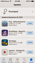
Within the AppStore app, you can now see the recently updated apps and read the notes for the last update. You see the date of the update, the app list, version of apps and description.
Downloading apps status - the icon will show a moving pie graphic that depicts the status of the app download. Notice the Hulu plus icon in the home screen and the download status of an app located within a folder (Favs on the dock).
Unlimited Folders - folder can now hold an unlimited number of apps: no more "Games 1", "Games 2", etc. I have over 90 games in the above folder. Note that there page indicator dots at the bottom of the folder. Each page in the folder can contain 9 apps.
Folder background color will change based on the color of the wallpaper you have selected for the home screens. Notice above that the folder has a brown or beige background color while the folders below have a blue background because of the color of the wallpaper.
Email - swipe to left to delete or archive messages.
Messages - forwarding messages is handled differently. Press and hold on a message bubble to show the copy and more buttons.
Press the more option to display all message bubbles with the one you press and held selected.
You can delete or forward this message (or multiple messages by selecting more messages) by pressing the "trash can" at the lower left or the "forward arrow" at lower right corner.
Within the message, you can now tap the "Contact" button to present icons to call, FaceTime or view contact information.
Block Callers - from an individual contact, in the recent caller list or in the Settings app (under phone section) , a user can block a caller from sending the user a text message, email and of course from calling the user via the phone or FaceTime. The blocked user is unaware that a message or email is not sent, but they will receive a recorded message explaining that their call cannot be made to the intended party. The message is unique enough that a caller can come to know that the user has blocked their call. Callers that don't exist in your Contacts must be blocked from the recent call list in the Phone app; these numbers cannot be manually added in the Settings app.
You can block from within the call log's recently called list.
You can block from within a contact.
You can manage the blocked callers from the Settings app's Phone section.
You can add existing contacts to the block list from the Settings app.
Safari - forward and backward buttons have been added to navigate through web pages.
It now sports an integrated URL address and search into one area instead if two separate fields.
A newer preview pane view for open web sites is now available on the iPhone, instead of the tabs found on the iPad. The old pane placed the preview screens vertically which allowed the user to see only one pane at a time. The new view stacks the preview windows horizontally, which allows more panes to be viewed at once.
You also can see the open pages from your other devices, plus open a private session for browsing.
Music - iTunes Radio is now available in the music app. Similar to Pandora, iTunes Music allows the user to create stations based on Genre, artist or song title. The service is free. It has audio and visual ads.
Photos - photos are now sorted my moments based on location and/or the blocks of time that pictures are taken. Instead of a continuos or endless rows of pictures in a straight column, moments breaks the pictures into smaller segments or groups of pictures that makes it easier to identify an area where a picture can be located for viewing or sharing.
Maps - the old maps used to show alternative routes labelled as Route 1, Route 2, and Route 3. Now they are labelled with the time that it will take you to reach the destination, such as 35 min, 37 min and 38 min. This allows you to determine if an alternative route is better right always instead of showing this information after you select a route like before. The green street signs are gone and it even changes the graphics based on the time of day (I.e. night mode). It still prohibits you to pan to a spot on the route while in direction mode. You still can only see the current segment you are driving or an overview of the entire route (Come on Apple).
What good would a new phone or newer IOS version be if it sounded like the old phone and old iOS? Apple has added some newer sounds to make your new phone or new iOS be heard above the crowd. Here are just a sample of the available new sounds.
The biggest change is that iOS 7's Siri no longer use Google as the search engine for web searches; it uses Bing. Additionally when it does the default Bing search, it shows the results in the Siri screen and not in a browser.
So if you ask Siri to "Search the web", you will get search results from Bing.
You cannot change this search relationship at all, but if you are like me and prefer Google search over Bing, you can say "Google..." before your search query to get Google results.
In iOS 6, Apple allow is to use Siri to open apps. With iOS 7, you can finally toggle wifi, airplane mode, Bluetooth by asking Siri to turn them on or off.
Here is "Do not Disurb" being turned off.
Here is Bluetooth being turned off.
How about playing music on iTunes Radio? Siri takes care of that too. Even pausing it by voice as well.
Did I miss any iOS 7 features you have found or that you use?
Carl W. Brooks
@techloyal
http://youtube.com/palmloyal
http://www.iamthereforeipad.com
Source : iamthereforeipad[dot]com


Không có nhận xét nào:
Đăng nhận xét